This page will guide you, as an editor, through the styles across the site. Further down the page you will see examples and the explanations for the use of the formatting styles. Firstly, the following is a summary of the standards to language use across the website:
On this page you will find information on and examples of:
Headings | Images | Bulleted Lists | Numbered Lists | Links | Grids | Accordions
House style - basic house rules for language use
- Keep it short and simple. If you can delete something and the message you want to get across remains, delete it.
- Do not use formal or long words when easy or short ones will do. Use ‘buy’ instead of ‘purchase’.
- We lose trust from people if we write using buzzwords, acronyms and jargon. Be open and specific.
- Tone of voice - accessible, warm, informal and relevant to the times we live in.
Explaining the Diocese consistently
Church House Guildford
Upper case, internal use mainly.
the Diocese of Guildford
The name of the organisation, capitals.
the diocese
The area with everything in it. No capital.
the Diocese
Shortened form of the Diocese of Guildford, theorganisation.
Diocesan
Used when referring to something owned bythe Diocese, in the place of ’s.
Formatting styles
'Heading 1' (at the top of the page) is the font style for the page title and gets applied automatically at the top of the page with the text entered in the 'Page Title' box in Global Office. That is the only use of Heading 1 you should see across the site. This body text is the 'Normal' font style. The following lists the font styles and a brief explanation for each use.
Titles and Headings generally should not be capitalised all the way through - i.e. Parish support not Parish Support.
Heading 2 | Top Level Headings
Use 'Heading 2' to mark sections on a page. E.g. Weddings.
Heading 3 | Sub-Headings
Use 'Heading 3' to mark sub-sections across a page. E.g. Marriage preparation materials (under Weddings). A bold Normal font style can be used if further subheadings are needed.
Heading 4 | Team Listing Name
Use 'Heading 4' for the name of someone when listing them on a team listing page. See example below.
Heading 5 | Team Lisiting Role
Use 'Heading 5" for the role title when listing them on a team listing page. See example below.
This is an example of a blockquote and can be used to quote a person or a Bible verse.
Team Listing Example
NAME
ROLE
WORKING HOURS
Brief description role. Between 90 and 128 characters, including spaces and punctuation.
Images
Images should be used sparingly across the website to make sure they have the intended impact on a page. The sizes of images should be set using percentages this ensures that the aspect ratios are consistent no matter the device. You can find out more about using and editing images on the website by reading the Images guide for web editors (contact the Comms Team if you require access). Below are examples of the standard percentages and alignments used across the site.
Hero/banner image - 100% width
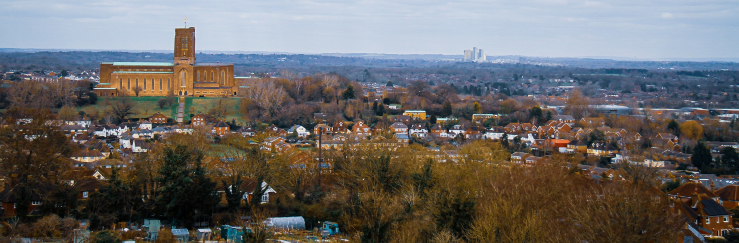
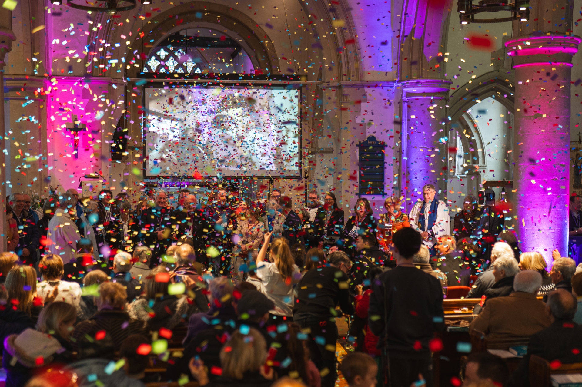
Image in text - left and right aligned - 50% width with 10 HSpace
Lorem ipsum dolor sit amet, consectetur adipiscing elit, sed do eiusmod tempor incididunt ut labore et dolore magna aliqua. In hac habitasse platea dictumst vestibulum rhoncus. Sollicitudin ac orci phasellus egestas tellus rutrum. Pretium viverra suspendisse potenti nullam ac. Non arcu risus quis varius quam. Pharetra massa massa ultricies mi quis hendrerit dolor magna eget. Semper feugiat nibh sed pulvinar proin gravida. Faucibus interdum posuere lorem ipsum dolor sit amet consectetur adipiscing. Turpis nunc eget lorem dolor sed viverra ipsum nunc aliquet. Vel orci porta non pulvinar neque laoreet suspendisse interdum consectetur. Volutpat commodo sed egestas egestas fringilla phasellus faucibus.
Fringilla urna porttitor rhoncus dolor purus non enim praesent elementum. Scelerisque purus semper eget duis at tellus at urna condimentum. Consequat nisl vel pretium lectus quam. Massa tincidunt dui ut ornare. Sit amet justo donec enim diam vulputate ut pharetra. Pellentesque dignissim enim sit amet venenatis urna. Turpis massa tincidunt dui ut ornare lectus. Vitae tempus quam pellentesque nec nam aliquam sem et. Sed id semper risus in hendrerit gravida rutrum quisque. Lectus proin nibh nisl condimentum id venenatis a condimentum. Mollis aliquam ut porttitor leo a diam sollicitudin. Enim ut sem viverra aliquet eget sit. Vel pharetra vel turpis nunc eget lorem. Ipsum a arcu cursus vitae congue mauris rhoncus aenean. Nisi vitae suscipit tellus mauris a. Arcu cursus vitae congue mauris. Pharetra vel turpis nunc eget lorem. Nam aliquam sem et tortor consequat id. Dui id ornare arcu odio ut sem nulla pharetra diam.
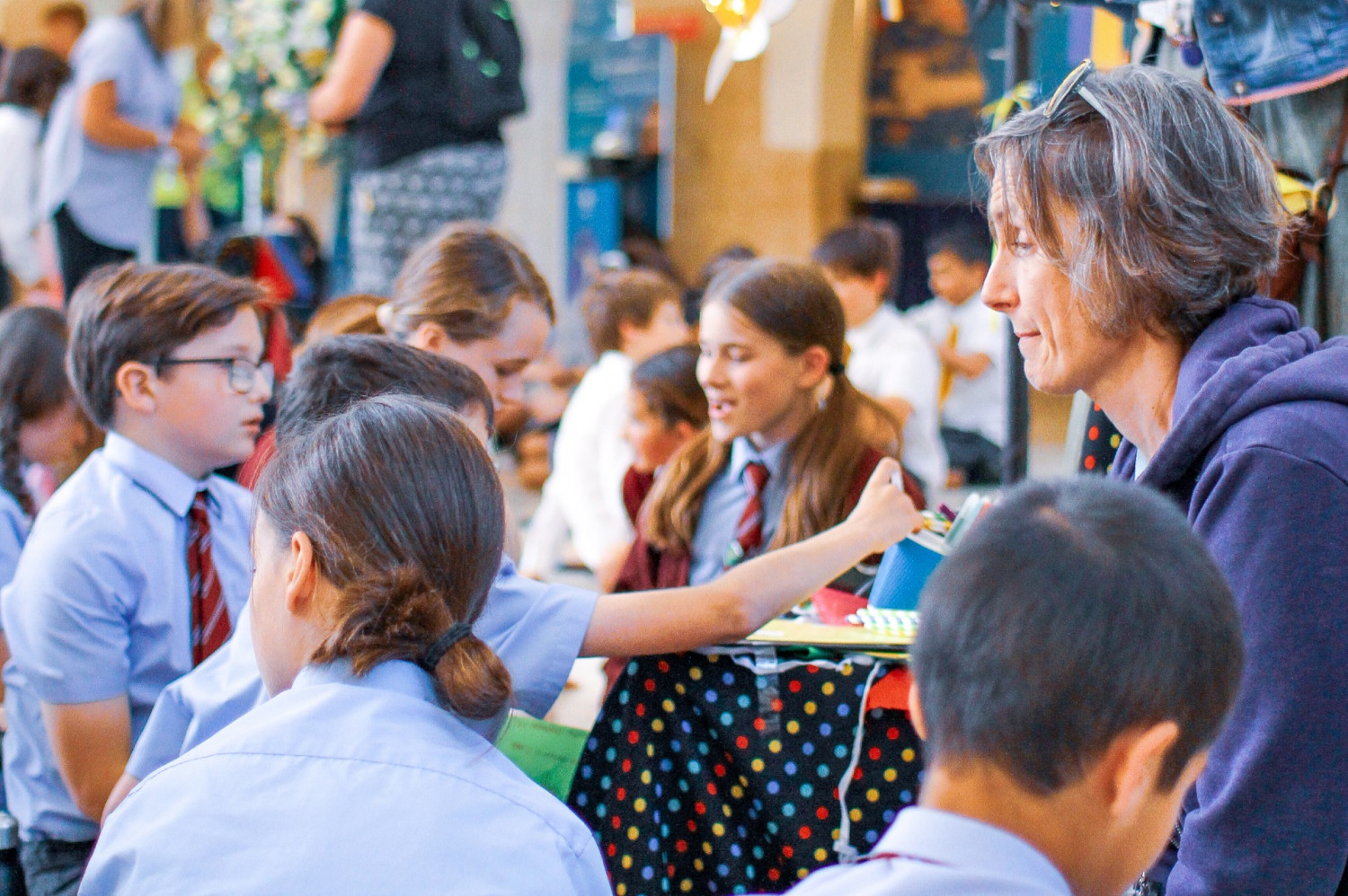
Image in text - left and right aligned - 30% width with 10 HSpace
 Lorem ipsum dolor sit amet, consectetur adipiscing elit, sed do eiusmod tempor incididunt ut labore et dolore magna aliqua. Consectetur adipiscing elit duis tristique sollicitudin nibh sit amet. Fames ac turpis egestas sed tempus urna et pharetra. Nam at lectus urna duis. Non sodales neque sodales ut. At erat pellentesque adipiscing commodo elit at imperdiet. Fringilla urna porttitor rhoncus dolor purus non enim praesent. Egestas purus viverra accumsan in nisl nisi scelerisque. Tempor orci eu lobortis elementum nibh tellus molestie nunc. Nec sagittis aliquam malesuada bibendum arcu vitae elementum curabitur. Rutrum tellus pellentesque eu tincidunt tortor aliquam nulla facilisi cras. Eget nullam non nisi est sit amet. Arcu cursus euismod quis viverra nibh cras pulvinar mattis nunc. Nec sagittis aliquam malesuada bibendum arcu vitae elementum. Ullamcorper dignissim cras tincidunt lobortis feugiat vivamus. Viverra vitae congue eu consequat. In ante metus dictum at tempor commodo ullamcorper. Tempus urna et pharetra pharetra massa massa ultricies mi quis. Pellentesque habitant morbi tristique senectus et. Erat nam at lectus urna.
Ultrices eros in cursus turpis. Diam donec adipiscing tristique risus nec feugiat in. Viverra mauris in aliquam sem. Ut sem viverra aliquet eget sit amet tellus cras adipiscing. Vitae tortor condimentum lacinia quis vel eros donec. Aliquam malesuada bibendum arcu vitae elementum curabitur vitae. Orci eu lobortis elementum nibh tellus molestie nunc non. Sollicitudin nibh sit amet commodo nulla facilisi nullam. Accumsan tortor posuere ac ut consequat semper. Adipiscing tristique risus nec feugiat in fermentum posuere urna nec. Volutpat lacus laoreet non curabitur gravida arcu ac tortor. Nisi quis eleifend quam adipiscing vitae proin. Id donec ultrices tincidunt arcu non sodales neque. Turpis in eu mi bibendum neque egestas congue quisque. Velit aliquet sagittis id consectetur purus ut faucibus. Mattis nunc sed blandit libero. Leo urna molestie at elementum eu facilisis sed. Condimentum mattis pellentesque id nibh tortor id aliquet lectus proin. Nisi lacus sed viverra tellus in. Est ante in nibh mauris cursus.
Bulleted List
The following shows an example of a bullet list:
- Sed diam nonummy nibh euismod tincidunt ut laoreet dolore magna aliquam erat volutpat.
- Ut wisi enim ad minim veniam, quis nostrud exerci tation ullamcorper suscipit lobortis nisl ut aliquip ex ea commodo consequat.
- Lorem ipsum dolor sit amet, consectetuer adipiscing elit, sed diam nonummy nibh euismod tincidunt ut laoreet dolore magna aliquam erat volutpat.
- Ut wisi enim ad minim veniam, quis nostrud exerci tation ullamcorper suscipit lobortis nisl ut aliquip ex ea commodo consequat.
Numbered List
The following shows an example of a numbered list
- Sed diam nonummy nibh euismod tincidunt ut laoreet dolore magna aliquam erat volutpat.
- Ut wisi enim ad minim veniam, quis nostrud exerci tation ullamcorper suscipit lobortis nisl ut aliquip ex ea commodo consequat.
- Lorem ipsum dolor sit amet, consectetuer adipiscing elit, sed diam nonummy nibh euismod tincidunt ut laoreet dolore magna aliquam erat volutpat.
- Ut wisi enim ad minim veniam, quis nostrud exerci tation ullamcorper suscipit lobortis nisl ut aliquip ex ea commodo consequat.
Links
Grids
This is an example of a grid in use. A grid will show as three columns wide when viewed on a standard desktop browser and then adjust to a single column when viewed on a mobile.
Accordions
The following shows an example of an accordion. An accordion is great for containing content that is relevant to a page without making it too dense. The accordion will show a + when collapsed and a - when expanded. Please speak to Comms if you need one used on your page as it will require coding or further training.

We are trying to ensure there is consistency across the website so please let Comms know if you see an accordion that looks slightly different, like the one below:
The body text is slightly different and the accordion title and +/- aren't quite in line.